
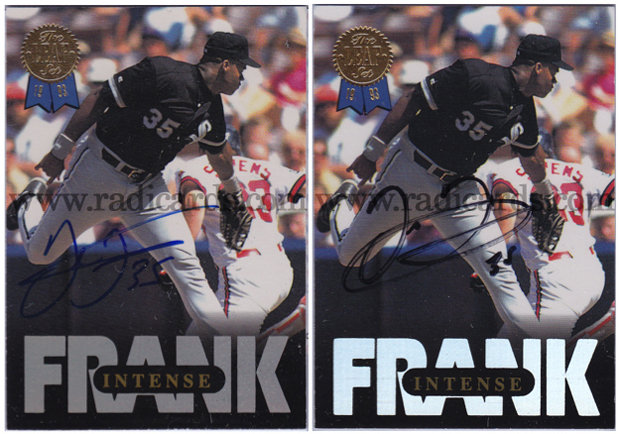
This is interesting. Here are two different Frank Thomas autographs on card #3 of the 1993 Leaf Thomas set. The one on the left is official and comes with a certificate of authenticity (COA) while the one on the right comes with nothing at all. I could have the one on the right authenticated (it might be fake) but that wouldn’t make for a very exciting comparison entry now would it? So let’s have a look at what we’ve got here and evaluate something of a comparative analysis between the two autos:
Official (left): This auto is a classic example of a mid 90’s Frank Thomas signature. The characteristics of such are as follows: The start of the F has a bit of a check mark and the top of the F and T is sharp while rounded off at the bases. Both letters are legibly crossed. There’s a hint of writing just after the F to symbolize the rest of his first name. Frank also wrote 35 next to his signature, the F and T are well written and clear.
Unofficial (right): This auto in contrast is a little less pristine. There is no check mark styling to start the F like in the official. There is a sort of rounding of both letter as if written in a hurry (which was likely the case). Much like the official auto, there is a brief hint of text just after the F to characterize the rest of Frank’s first name. Frank also still took the time to write 35 next to his name. Real or Fake?
Question of the Day:
What player do you think has the best looking autograph?
To see what’s currently on eBay from 1993 Leaf Thomas, click here.


Mantle, of course, always had a great signature. Those M’s are unparalleled, as well as his peers, Hank Aaron AND how could you forget Ted Williams. All great signatures, IMHO.
Agreed indeed! All great sigs. I’ve always thought that Cal Ripken Jr. had a really great signature too.
And Babe Ruth.
Oh yea, I totally forgot about Bambino. Good call, Tim 🙂
For pure penmanship and style – I would nominate Andre Dawson. The man’s sig is old school skill and sweet to look at.
Weird coincidence – Dawson was one of the players that Frank Thomas looked up to when growing up. And probably not a coincidence – another football player convert. 🙂
And even though it wasn’t asked – I would put Greg Maddux for ugliest/most illegible autos ever.
I’d have to agree with you Lance, the Dawson sig is pretty classic. As for ugly and somewhat confusing sigs, I’d have to nominate Willie Mays. I don’t know what he’s writing there but those don’t look like W’s and M’s. 😛